
Background
Learning accessible design and development wasn't intentional, but it also wasn't an accident. I like to think UX should be approached like a craft, and therefore all aspects of it interest me. My often repeated mantra is, "Accessibility is a User Experience," so naturally, I picked up these skills along the way since I consider all user experience topics within my purview.
Problem:
Accessibility in software development is overlooked far too often for a variety of reasons. It's seen as doing "extra" while returning little. Not only that, but accessibility is usually introduced in its entirety, making it very overwhelming for product teams to pick up while also managing their daily tasks.
In several of my previous roles, I have been tasked with teaching product teams (and executives) what accessibility is, how to comfortably include it in the product life cycle, and how to analyze our products through the lens of accessibility.
This case study is an overview of how I break down accessibility in a way that makes the topic easier to understand.
Foundation:
It's beneficial to begin by explaining why accessibility is important. While most people have a general sense that it matters, providing statistical data that highlights its true impact can be more persuasive. I won't cover all the data here, but I will highlight a few key reasons why software companies should prioritize accessibility.
- It's Good For Business - It's estimated that 1 in 6 people in the world have a disability. That's over a billion people. Building a product that ignores a population the size of China is certainly not good business.
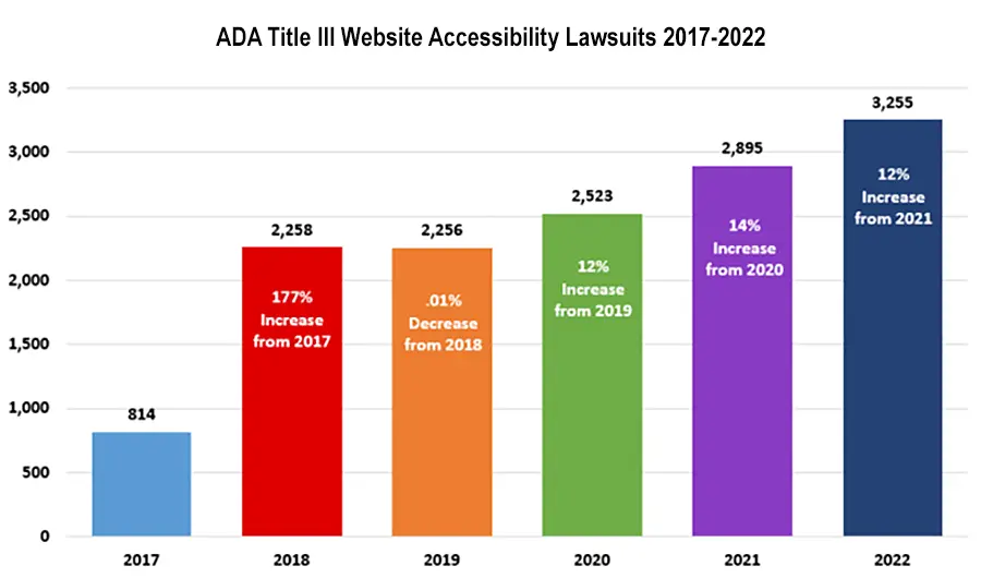
- Possible Legal Problems - Ever since Domino's pizza was sued for not having an accessible website, the number of lawsuits in the US has increased over 300%. Worldwide, there are over 70 accessibility laws and policies. It's easier to just be accessible than to keep up with all of them.
- Accessibility Is For Everyone - Accessibility is an easy way to level up an overall user experience. It is referred to as the Curb Cut Effect. This is when accessibility focused enhancements benefit everyone. Dark Mode would be a great example of this.
Accessibility Heuristics:
As I mentioned before, accessibility is often introduced to product teams in its entirety, typically referencing the WCAG, a comprehensive set of guidelines with 78 Success Criteria. Much of this criteria is subjective and detailed, making it quite intimidating for teams to grasp. To simplify the learning process, I created a set of 6 Core Accessibility Heuristics.
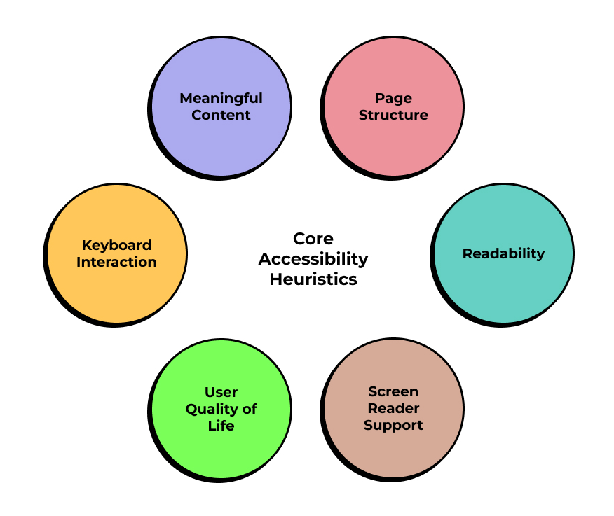
These heuristics allow teams to more easily understand what the expectation is from a user's perspective. This simplifies they way accessibility is included in product requirements. The summary of each heuristic is as follows:
| Heuristic | Details |
|---|---|
| Keyboard Interaction | Ensure that all interactive elements are accessible and operable via keyboard. |
| Meaningful Content | Ensure important information are clearly described in text. |
| Page Structure | Ensure that the structure and functionality of the page are logically organized for easy navigation and interaction. |
| Readability | Ensure that text content is readable and understandable. |
| Screen Reader Support | Ensure that all non-text content is identifiable and correctly labeled for screen readers. |
| User Quality of Life | Ensure that the interface design accommodates user preferences and needs. |
These heuristics are based on the 10 heuristics recommened by Deque University
I felt that 10 was a bit much, so I reorganized them into 6. Each heuristic corresponds to a specific WCAG specification. This system of heuristics is entirely customizable based on the organization's needs. As you can see in the Spreadsheet Breakdown (see Heuristics Sheet), I have prioritized them based on the needs of my last job. I also highlighted which role was primarily responsible for each heuristic, though these are subjective and often overlapping. It's more of a guide than a strict set of rules.
The questions within each heuristic are not meant to be used all at once. They can be gradually introduced over time, based on the needs of the user and the capacity of the product team.
Practical Application:
To demonstrate how these heuristics can be used to quickly evaluate a user experience, I have provided an analysis of a website for a trade show I attended while conducting research for the Envvia Jewelry Retail App Case Study.
There are two types of accessibility analyses that I perform. One is a quick heuristic analysis, which I will demonstrate now. The other is a full audit, which involves both automated and manual testing. The latter is much more thorough but also takes significantly more time and requires more technical expertise. Therefore, I recommend teams conduct a heuristic analysis and leave the manual testing to a dedicated tester.
In a heuristic analysis, one simply answers each question about the UI. It's really that simple. For this example, we'll examine the JCK Jewelry Show website. Let's check its Keyboard Interaction heuristics.

| Heuristic | Result | Comments |
|---|---|---|
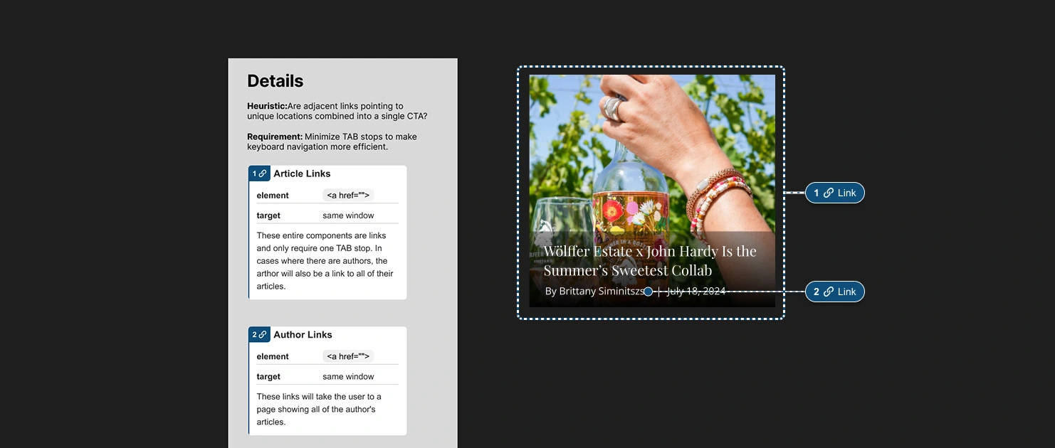
| Are adjacent links pointing to unique locations combined into a single CTA? | No | In many articles, the image as well as the title are links to the same place. This makes for extra, unnecessary key presses. |
| Are all calls to action (CTAs) built to fully function with keyboard and touch in addition to the mouse? | No | Navigation submenus can't be opened with a keyboard. They only open when hovered on using a mouse. |
| Can single-character shortcuts be turned off or remapped, or are they only triggered when the relevant control has focus? | NA | Not applicable. |
| Can users cancel an operation by moving focus away from a control before releasing it? | YES | All CTAs work as they should. |
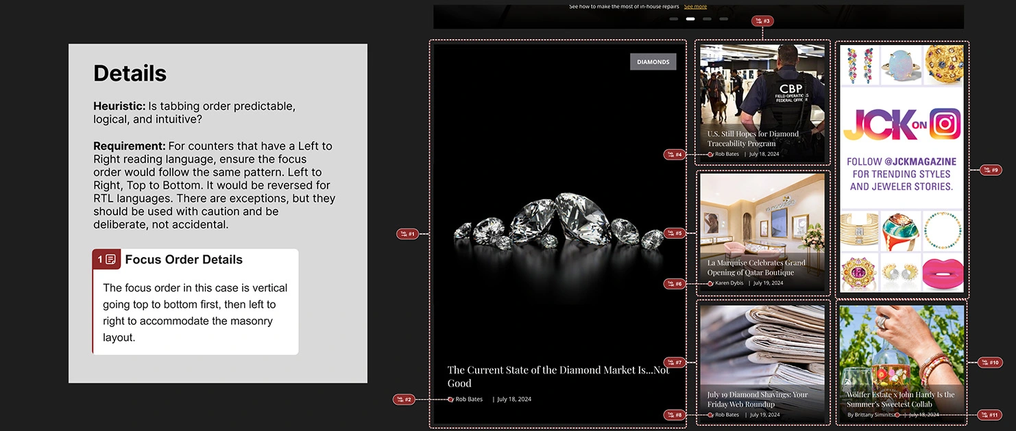
| Is tabbing order predictable, logical, and intuitive? | No | This is an example of the subjectivty of accessibility. I find the layout of the news section on desktop kind of chaotic. It doesn't help that you can't see the focus at all. |
| Are buttons, links, and other CTAs designed to consider both hover and focus states? | No | As mentioned before, the navigation doesn't have focus states. |
| Is the focus indicator clearly visible when active elements receive focus? | No | There are no focus indicators for any element on the page. |
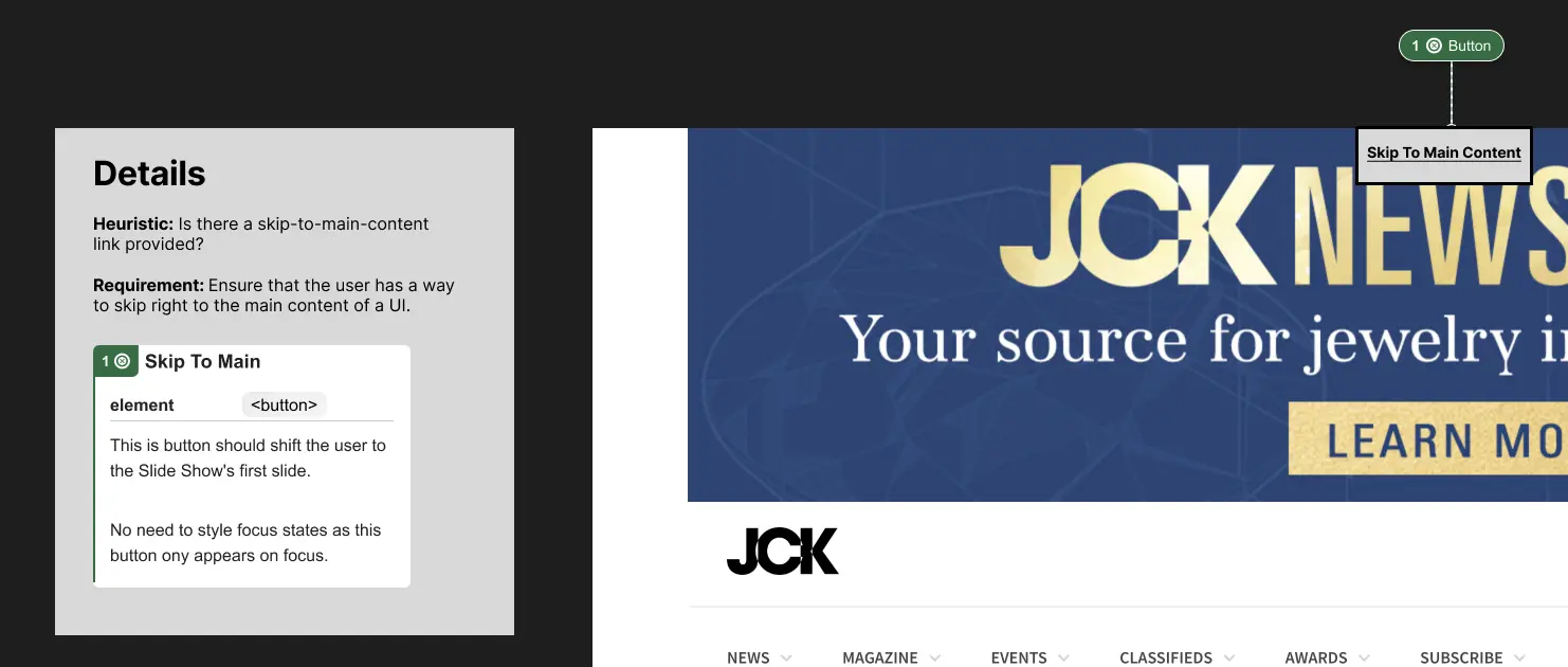
| Is there a skip-to-main-content link provided? | No | There is no skip link present. |
| Are users able to dismiss newly displayed content without moving their mouse or shifting focus? | NA | Not applicable. |
As you can see from the results, the homepage is a nightmare for keyboard users. I find that UIs that fail keyboard interaction heuristics typically perform poorly on all other heuristics as well. Feel free to visit the link above and try navigating the site with a keyboard to experience it for yourself.
Because the heuristics map to a WCAG spec, it makes it very easy to complete an Accessiblity Conformance Report or VPAT based on these findings.
Design:
Designers find it easier to learn accessibility through this method. I usually structure my Figma files to reflect the heuristics when designing for accessibility. When PMs, engineers, and designers all approach accessibility the same way heuristically, anyone can easily look at an annotated Figma file and understand what's going on.
Here I am annotating screenshots of the UI to show how this looks in practice. I'm using the CVS Annotation Kit which is very useful for design handoffs.
Conclusion:
I am working on building an online guide to make this information available to the public. Using this system, I strongly believe that any team can adopt good, efficient, accessibility practices if given the time and space to do so.
Key Outcomes
- Created a heuristic system that allows teams to easily understand accessibility.
- Simplified accessibility analysis that can be used by virtually anyone that wants to learn.
- Made accessibility in the product life cycle customizable based on product needs and team skill levels.